Accessibility and Performance
We briefly covered Performance in Overlapping Areas of accessibility. To expand on that topic, let’s touch on a few design characteristics that intersect Accessibility and Performance.
Page load time and “skeleton layouts”
In recent years it has become commonplace to load a visual “skeleton” where layouts consist of faint grey boxes, borders, blocky lines and circles. The intent is to make our brains feel as if something is loaded while we wait for data to be fetched, processed, and rendered on screen.
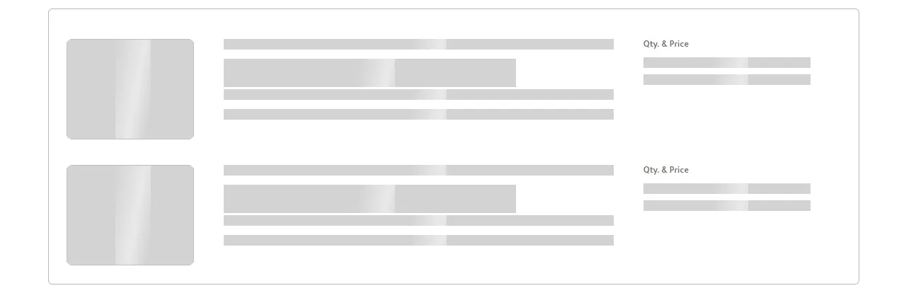
But this is a very visual approach to a performance problem. If you can’t see the screen and rely on Assistive Technology, you might have no idea what’s happening...and this could be a bigger problem on slow networks and devices.
To address this problem in an inclusive way, you could consider making a screen reader announcement as a part of loader components and skeleton layouts.
Minimize blocking interactions
Performance isn’t just a honing-your-craft kind of thing. If your pages are slow to load, not only could you use customers...but you could also prevent keyboard and screen reader users from interacting with the page as it loads. That is because certain JavaScript can block the main thread and keep the page from becoming interactive.
There are a couple of metrics you could measure to gauge the time it takes for a page to become usable with keyboards and screen readers:
- Total Blocking Time (TBT) (opens in a new tab)
- First Input Delay (FID) (opens in a new tab)
- Interaction to Next Paint (INP) (opens in a new tab) - a forthcoming metric
- Time to Interactive (TTI) (opens in a new tab) - an older metric
Performance as a User Experience Metric

Code isn’t the only way to think about performance and accessibility. You could also quantify how much cognitive effort it takes to complete a task by counting the number of clicks or other interactions required to use an interface.
How many keystrokes does it take?
Furthermore, can someone complete a task with a keyboard alone, and/or with screen reader? Does the same task a keyboard user a significantly larger amount of time than a mouse user? This can be unavoidable. But if doing what you can in the design phase (along with some keyboard shortcuts), you could improve the experience quite a bit.
There’s a classic text that was highly influential in how I think about user interfaces: Don’t Make Me Think (opens in a new tab) by Steve Krug. It’s pretty dated by now. But the ideas proposed in it still stand: the more complex an interface is, the more thinking it requires. And we shouldn’t expect users to think hard at all in order to use our interfaces.
There is a duality in this idea as well: simpler is often better to use, and easier to build & maintain.