Color/Visual Contrast
One of the most common issues on the web is poor visual contrast. If text colors or UI components are too faint over backgrounds, many users won’t be able to read or use a page.
Fortunately, there are some mathmatical formulas for calculating contrast that make it highly automatable with accessibility testing tools. The Axe API, WAVE, and other testing tools include contrast as one of their rules. There are also contrast checkers built into Firefox and Chrome that make debugging easy in the DOM.
That’s not to say that contrast should be left until development. In fact, contrast is really a design issue that should be solved before it reaches developers. But if a contrast issue is discovered in development, well…better late than never.
The Requirements
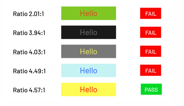
In WCAG 2.2, Level AA contrast is defined in criterion 1.4.3 (opens in a new tab):
- Regular/non-bold text size 24px and below must have a contrast ratio of at least
4.5:1. - Large-scale text 24px or greater must have a contrast ratio of at least
3:1.
(WCAG actually mentions 18pt text, which is a unit we don’t use on the web. 18pt = 24px.)
Non-Text Contrast
WCAG 2.1 introduced another success criterion for Non-Text Contrast (opens in a new tab). This covers things like text button background colors, icon buttons, form controls, and more. These components need to meet at least 3:1.
Tooling for checking contrast
- Axe for Chrome or Firefox (opens in a new tab)
- Firefox DevTools (opens in a new tab)
- Chrome DevTools (opens in a new tab) (has limitations / might not be as reliable as Firefox)
- Colour Contrast Analyzer (opens in a new tab) (desktop app)
- WebAIM contrast checker (opens in a new tab)
- Stark for Figma (opens in a new tab)
There are Level AA and AAA success criteria (opens in a new tab) in WCAG 2.2 for color contrast and a whole re-envisioning in WCAG 3.0. You should definitely stick with 2.2 for now.
Don’t rely on color alone
In user interfaces, we can’t rely on color alone to communicate information. That’s because some people’s brains might interpret colors differently.
Ensure that data visualizations, required form fields and error validation, links and more don’t rely on color by itself. Include patterns, underlines, shapes, labeling, or anything that can communicate something visually beyond color. There‘s even a WCAG success criterion for this: Use of Color (opens in a new tab)!
Links
Some interesting reads on contrast: